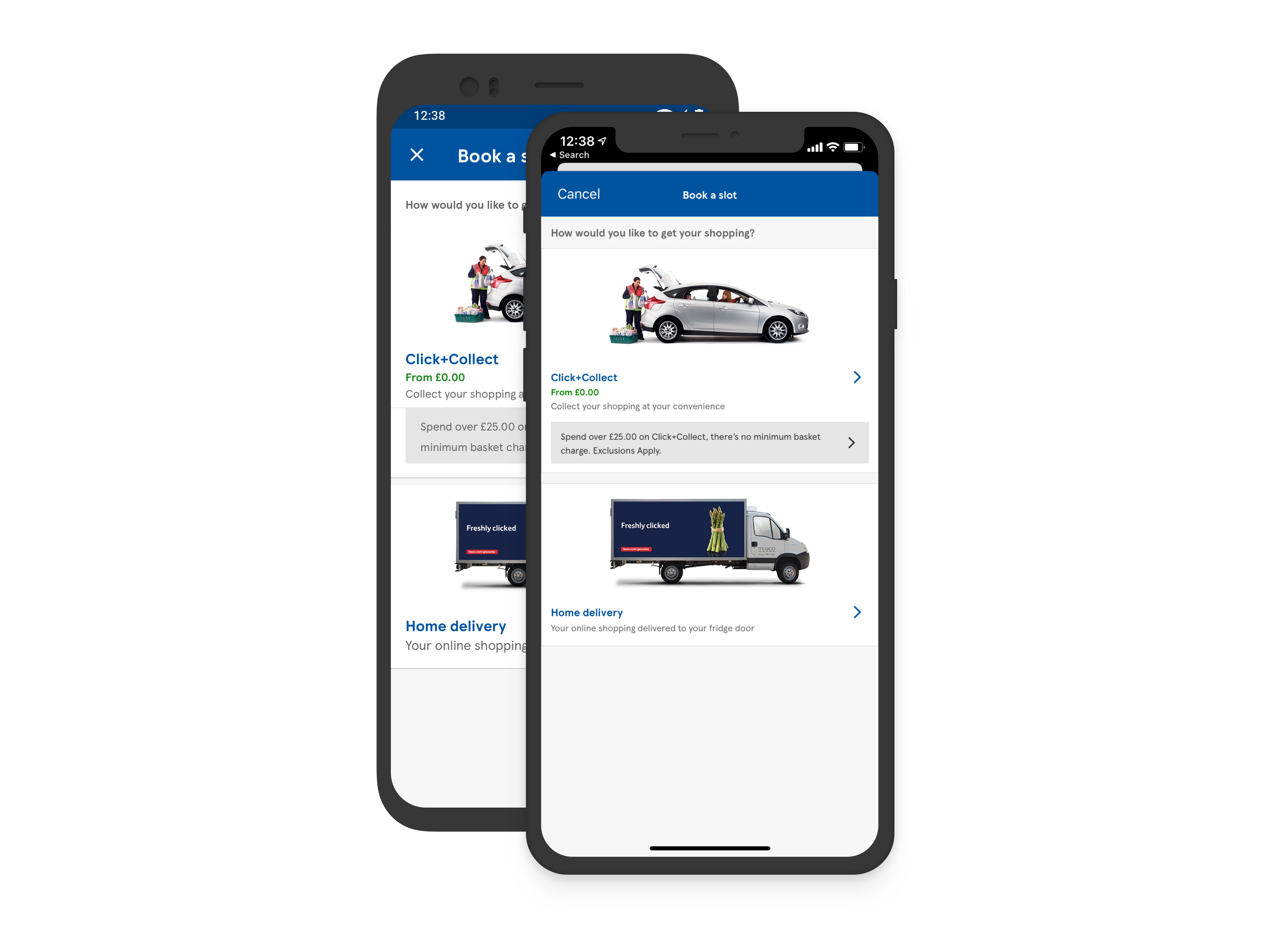
Click + Collect

Increasing customer fulfilment conversion to make it cheaper for both Tesco and the customers it serves

Team

4 Product Designers
12 Engineers
2 Test Engineers
1 Product Owner
1 Agile Delivery Lead.

Role

UX design and UI implementation

Challenge

As a business proposition, Tesco wants to persuade more customers to use the Click+Collect service as this is a much more profitable way to fulfil their online orders.

As many of Tesco customers are motivated by money saving, how might we help them choose the best way for them to receive their shopping.

Approach

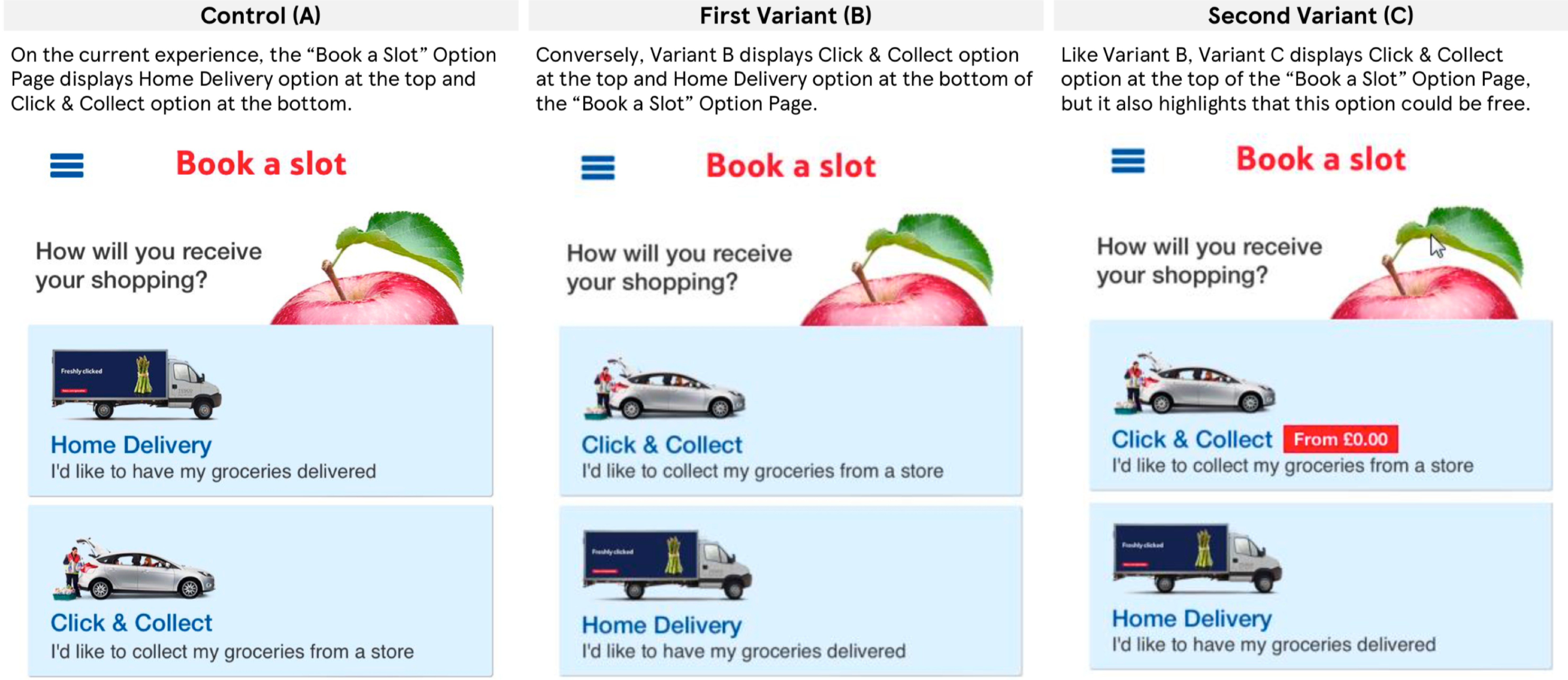
Produced high-fidelity mock ups, landing on 3 variants which we A/B/C tested with users.

Further verified with a live sample group, pushing successful variant to millions of users

Outcome

On the new platform, launch of variant C meant: of total orders, Click+Collect orders were up +5%
Process

Discovery

Research tells us that Tesco customers are price sensitive and driven by cost saving.

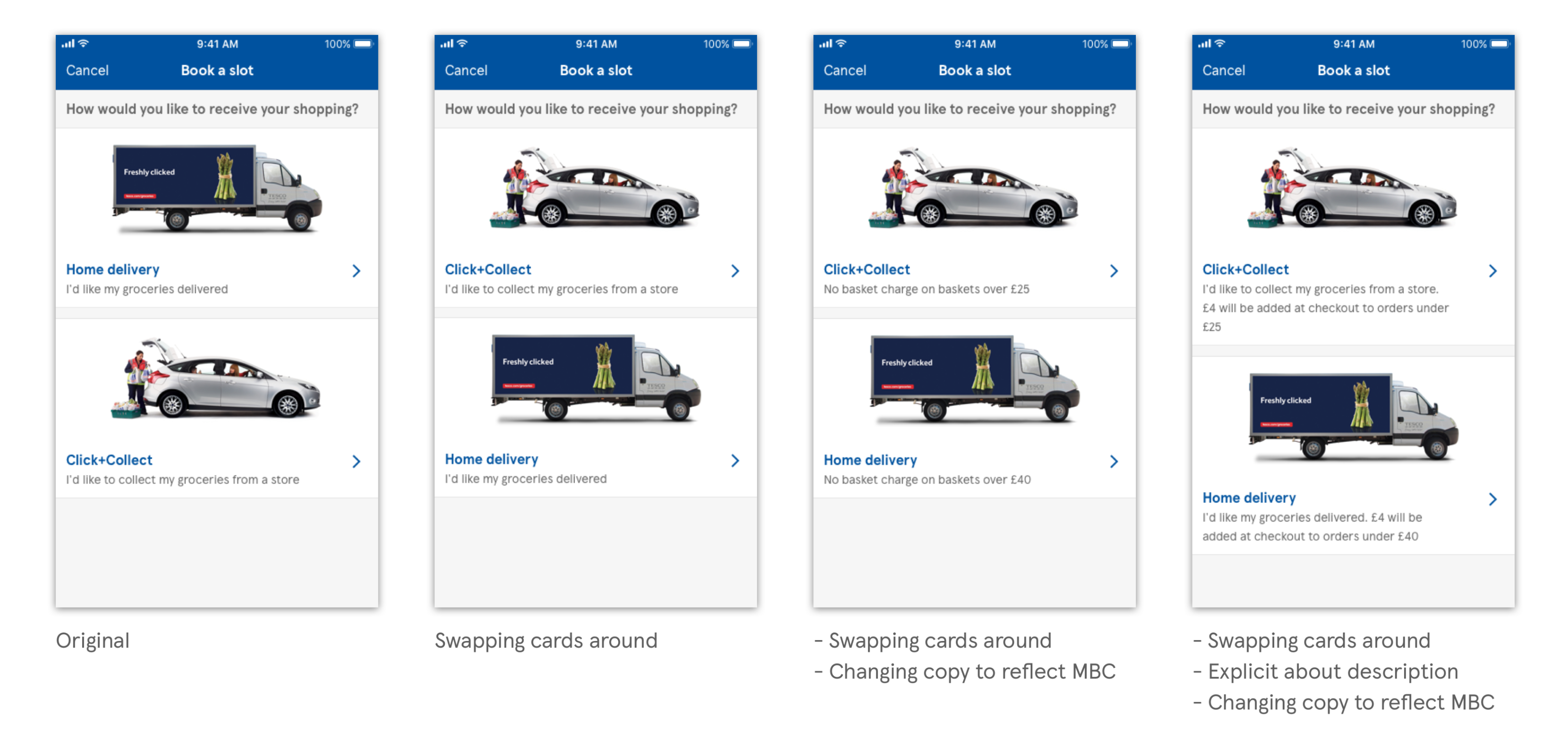
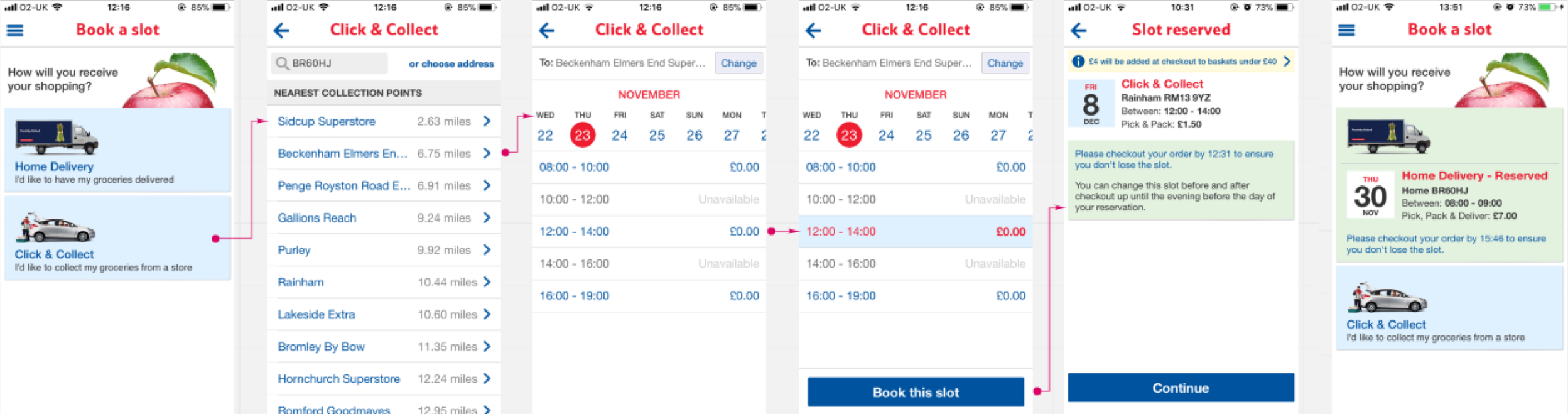
On learning the price difference in fulfilment methods for our customers, I looked at the current journey and was surprised to find that the price difference for click+collect vs home delivery wasn’t made obvious to the user:

With this is mind, I investigated every possible place we could intercept the user journey to best communicate the free click+collect and also a varying minimum basket charge on home delivery to guide users to the best possible choice.

I presented three options back to our product manager and design leads:

Option 1: 
A easy and minimal effort approach to the problem. Using existing components and which also doesn’t disturb the current user journey:
Option 2: 
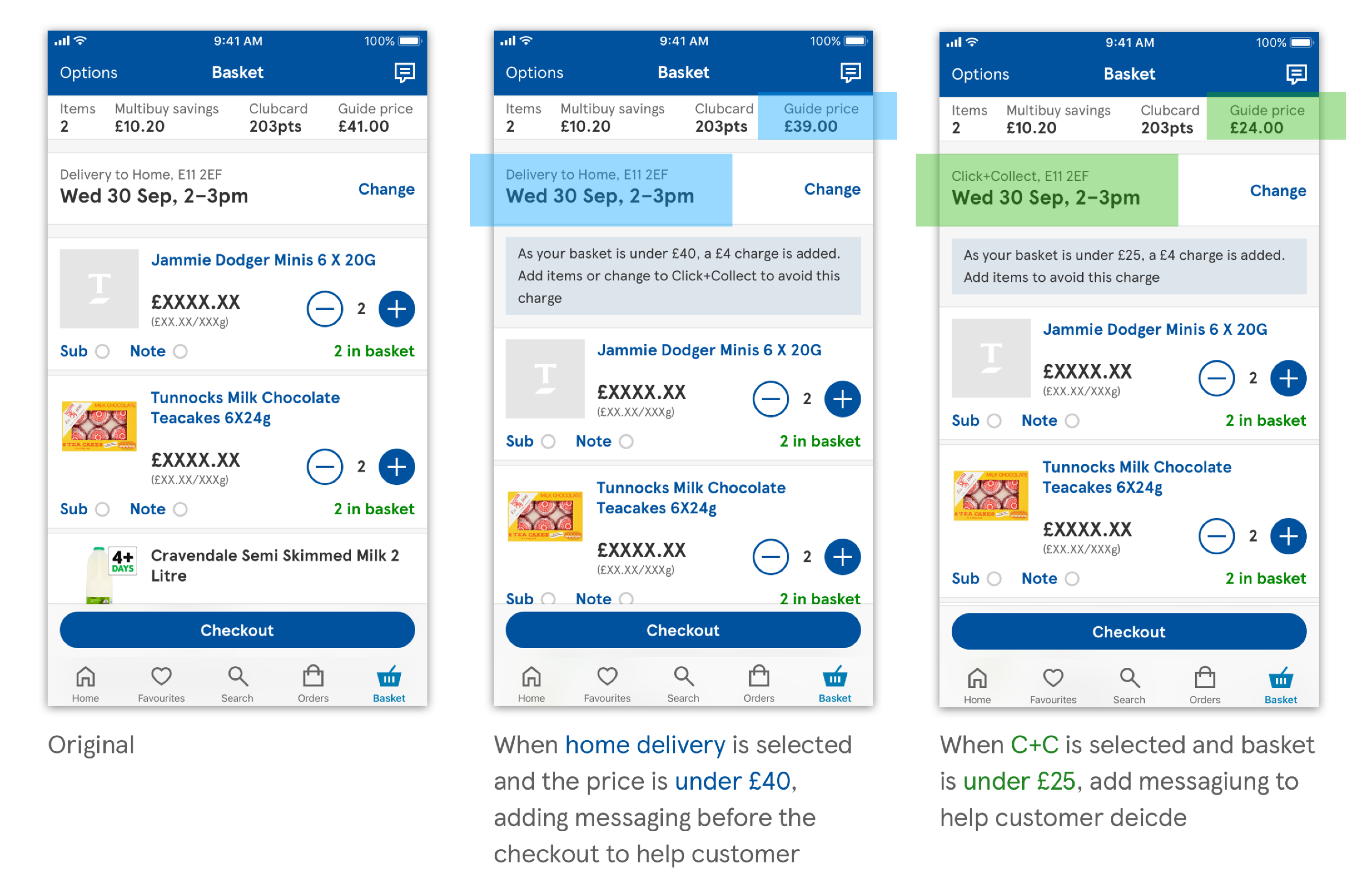
Understanding that “Guide price” is a variable depending on when people check out (if offers are still valid by the time they come to pay, for example).

I thought that this could be misleading, especially if someone thinks they have already qualified for free delivery and then they suddenly don’t have the option to Click+Collect.

Considerations: difficult to build on varying circumstances?

Messaging becomes wordy, increasing mental load on user and space taken vs purpose of message possibly unjust? On the plus - would this help users complete a full journey and increase adds to basket?
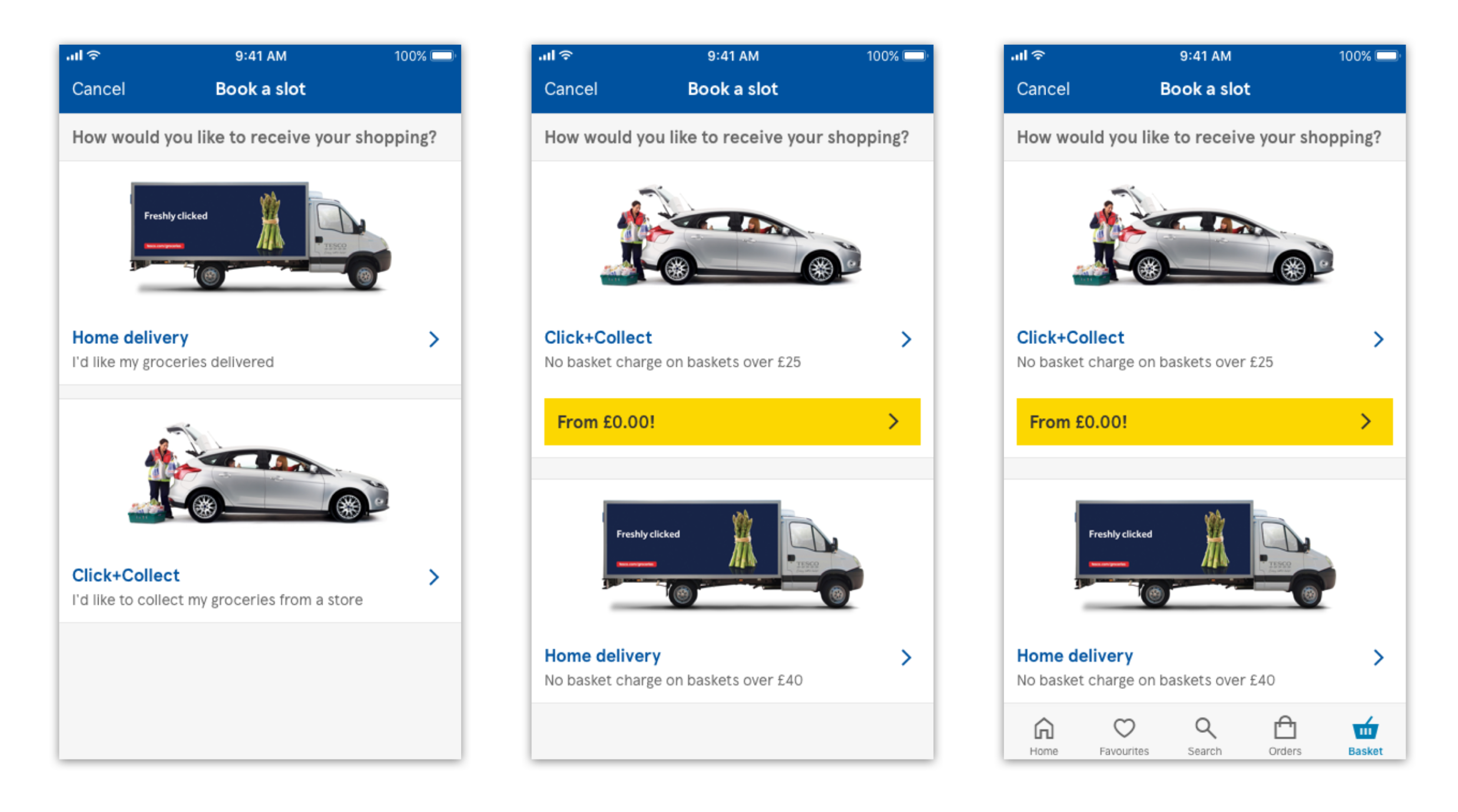
Option 3: 
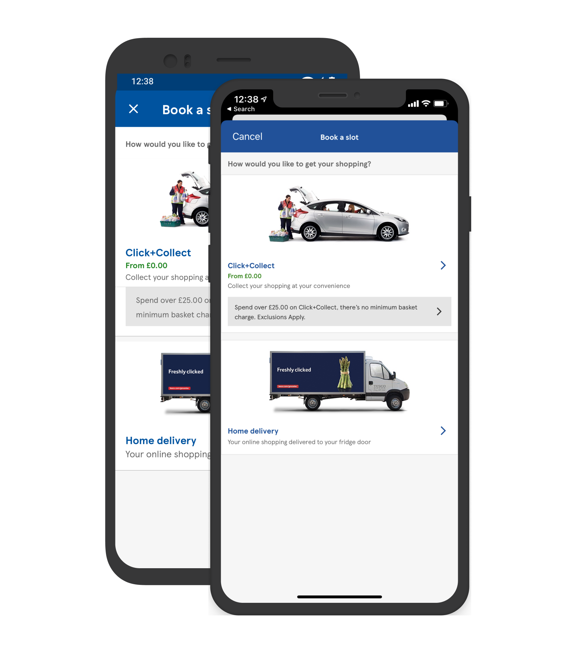
Similar to option 1 but with a much more enhanced UI approach. Copy adjusted to remove previous instructions about both fulfilment methods.

This would now just indicate the minimum basket charge and the change in price.

I also amended the copy tone of voice to be more positive: “no basket charge when you do X”, instead of “you will get a charge if you don’t do X”.

Test + Learn

We tested A/B/C tested 2 variants on the old platform while we still could (this was pre-launch to the general public) with a small set of users.


This meant we had a really cost effective result with a quick turn around where we could understand results and take them into consideration for the new designs. Key metrics, of total orders:

Variant B: rose by +2.6%.
Variant C: Click+Collect orders were up +6.3% ‍

Build + Refine

I refined the final messaging and made a more suitable UI component to display the price - something which would later become a reusable component.

Thanks for reading.