Order Amends

Making it easy for customers to amend their orders instead of creating costly new ones.

Team

4 Product Designers
12 Engineers
3 Test Engineers
1 Product Owner
1 Agile Delivery Lead

Role

UX design and UI implementation

Challenge

As users reported not being able to find their existing orders and amend them while on the go, how might we help them to do this as it is both inconvenient to them and costly to the business.

Approach

I facilitated the planning and running of an internal workshop with the design team to help get to an unbiased, educated and agreed outcome to test with users.

Outcome

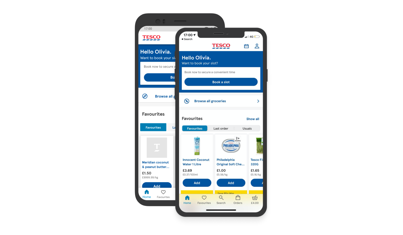
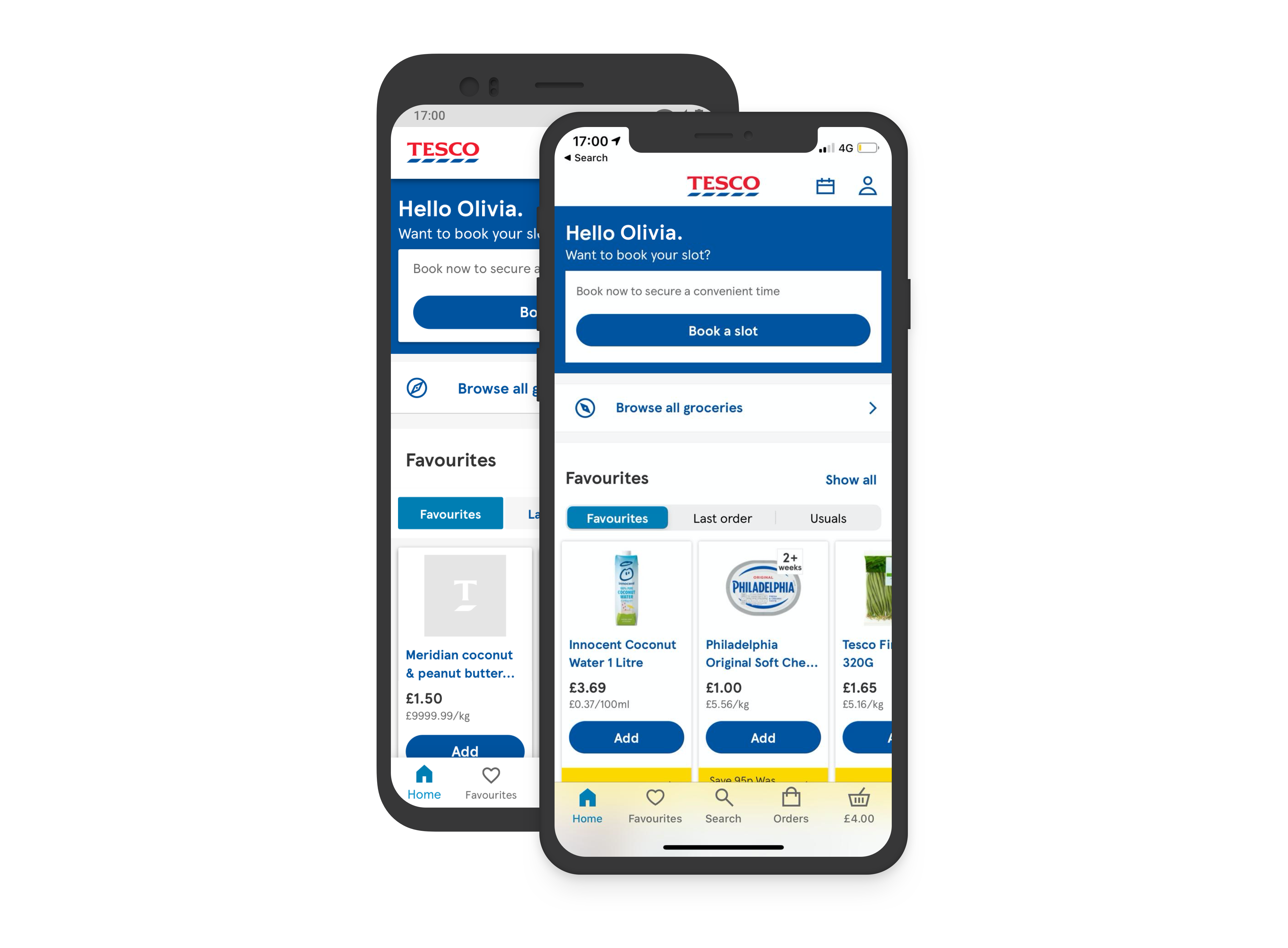
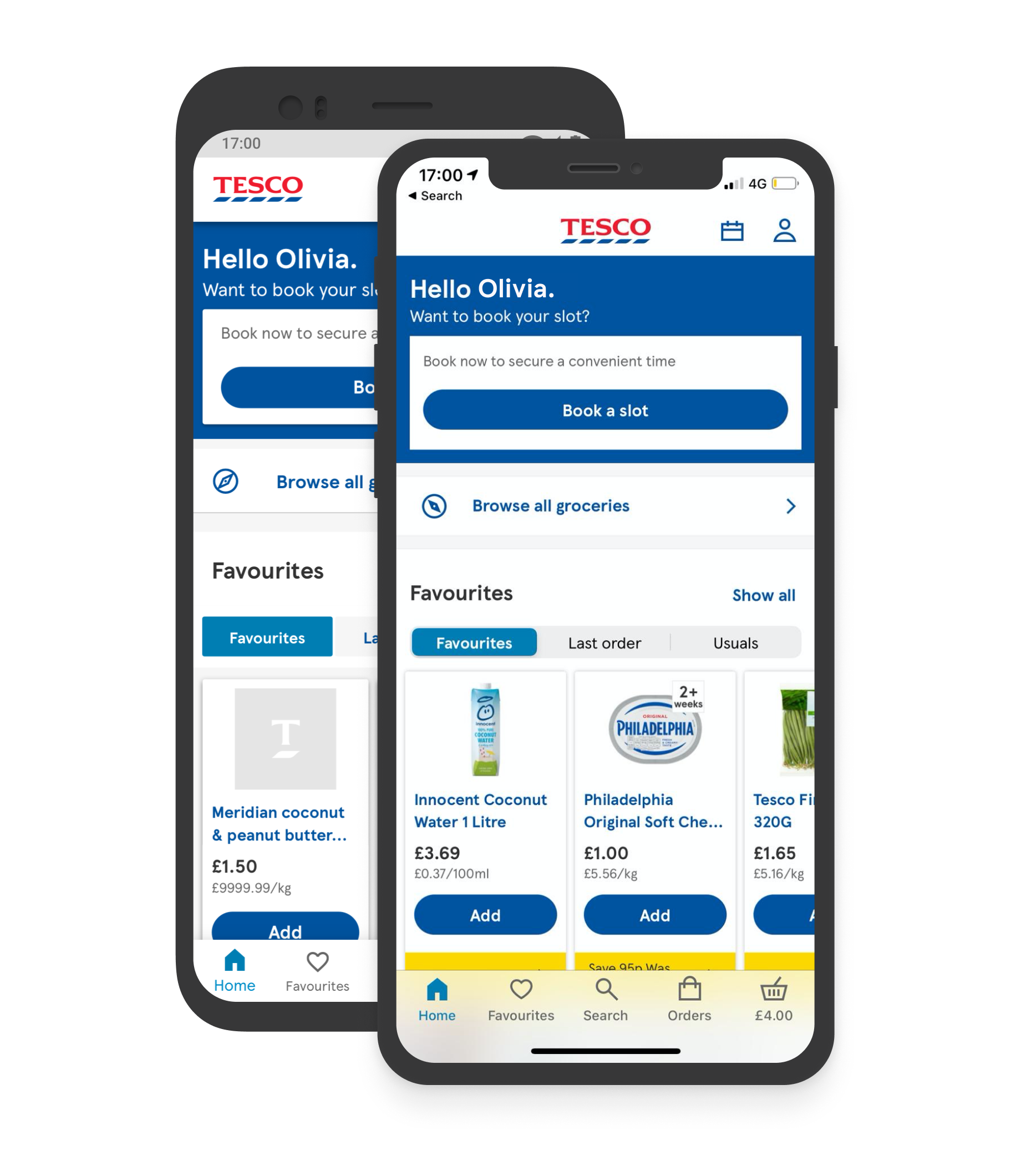
We moved ‘Orders’ into the tab bar and account moved to the top right on ‘Home’ only. Users amending their orders using the orders tab journey increased by 1.5%. This equates to an estimated £15m in upfront forecasted revenue per year from basket amends.
Process

Discovery

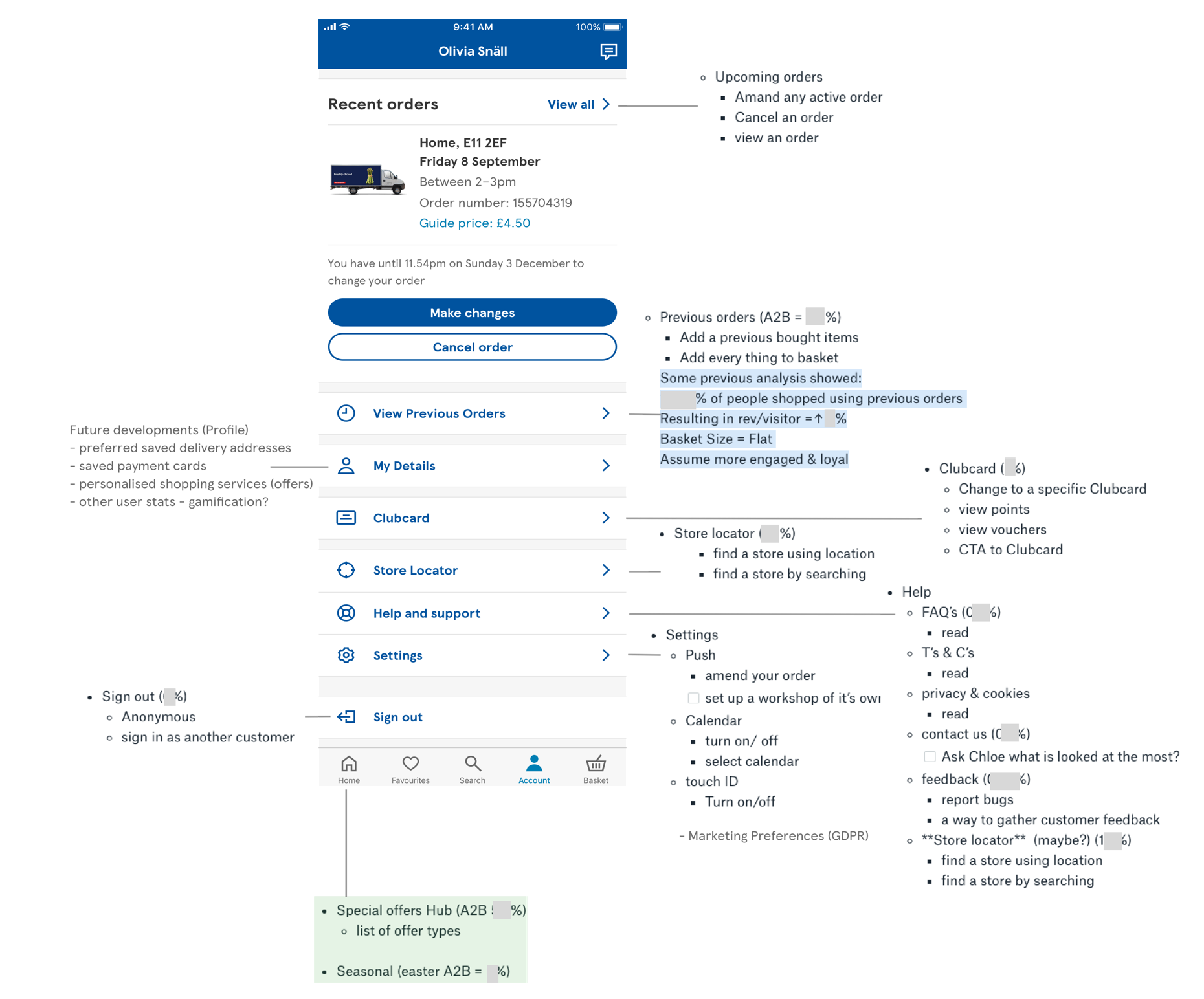
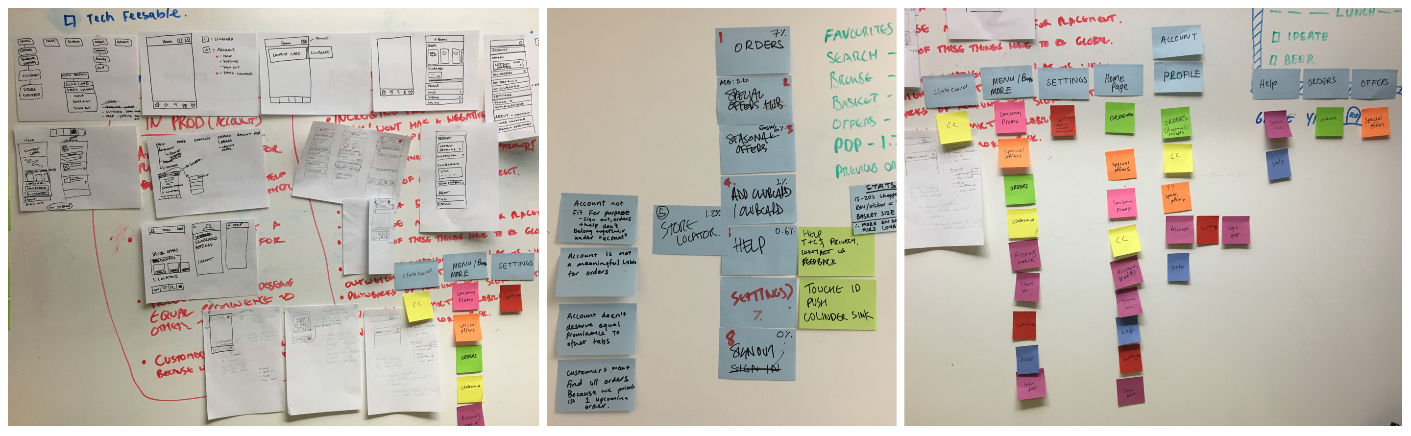
As a larger group we performed a card sorting exercise to understand the information architecture and our key user needs.

We then matched the usage data (e.g. page visits/activity, and business needs) to this information architecture to firstly, understand and then secondly, manipulate the IA to include an area where users could go and amend their orders.

The workshop brought together ideas from different groups and helped to understand the problem and eliminate what we couldn't do.

We had a facilitated discussion together then worked in our smaller teams to explore ways of how to execute these ideas.

Existing Behaviours

A data first approach: In our smaller teams, we looked at the current usage data for the 'account tab' and mapped this back to our user journey. This then informed how we would arrange the information.

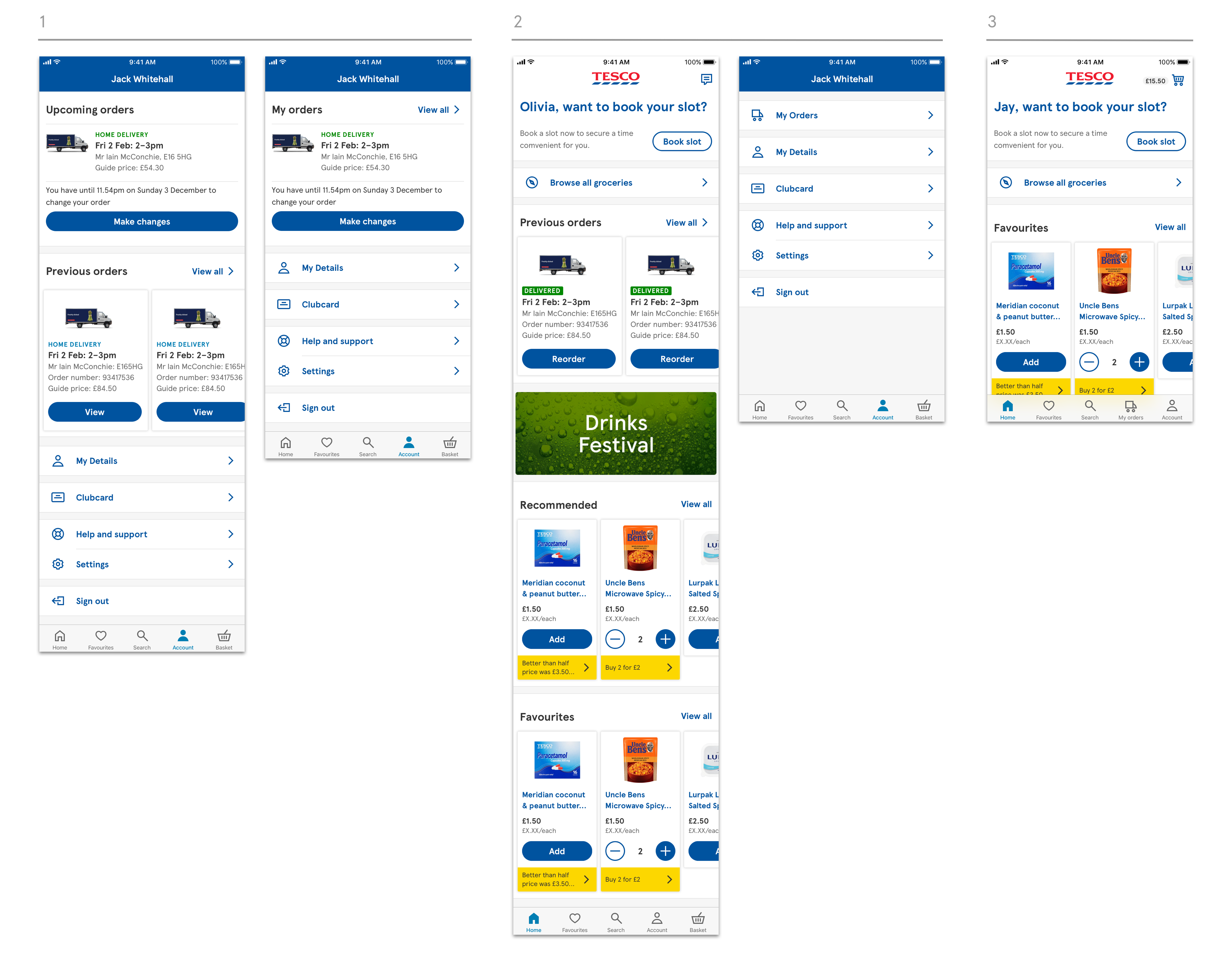
Early Design Exploration

Smaller team outcome - options we explored and talked about with other design team members:

Refine

Our recommendation. We believed keeping the orders tab in the main tab bar was key to helping users manage their shopping:

Moving the orders to the tab bar had a 1.5% increase in people using the orders tab.
In the process of moving this however, we identified a huge new problem to tackle around booking a new slot - when you already have a delivery booked (especially in the case with subscription members who have 2-3 deliveries a week, for example).

Qualitative research told us that people couldn't find how to do this.

Pivot!

On investigation I found that previously in the app, booking a new slot had been done using a burger menu on the homepage - users always knew where to access this, but in the new design, booking a new slot had now been added to the basket page which understandably wasn’t intuitive for users.

I was tasked with exploring our users' journeys and where we could add this order amends functionality in, and presented back three areas we could look at.

Re-define

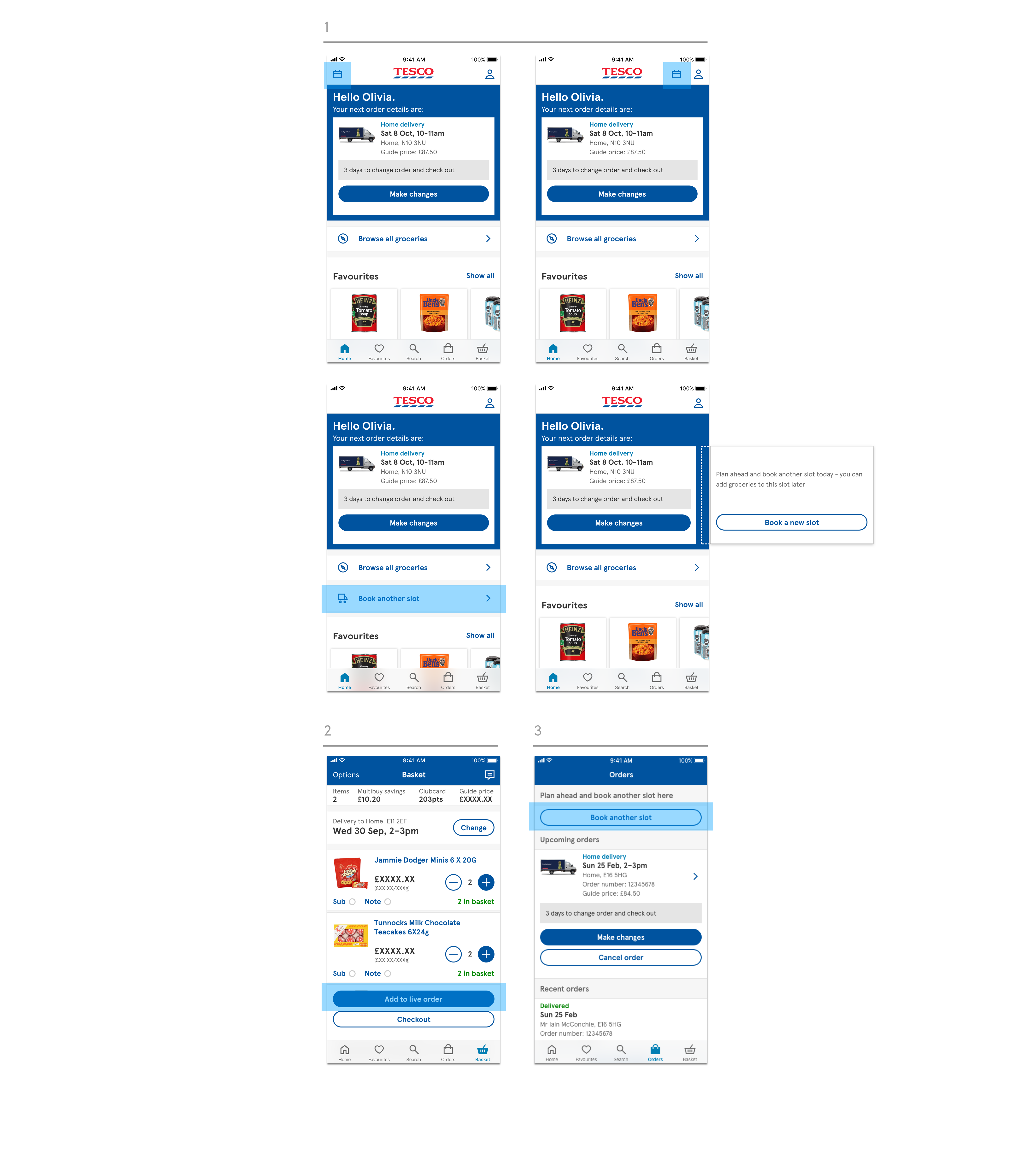
I focussed on three key areas of the user journey:

1. Homepage - as per previous user behaviour

2. Basket - as per newly taught behaviour

3. Orders tab - already taught users to book a slot at the start of their shop here.

Outcome II

As the initial main objective of the app's launch was based around reaching parity with the previous app (so as not to unsettle our users with a new interface or usability problems) after presenting back ideas to the product manager and design leads, the decision was collectively taken to add the calendar icon to the nav bar.

This proved useful and quantitate data showed a 1.5% increase in order amends overall.

Thanks for reading.